- How people see color is different for each individual.
- We see when light stimulates the Rods and Cones in our eyes. 3 types of cones: red, blue, green
- Why these are the 3 primary colors of light
- Red, Yellow and Blue are the primary colors in pigment.
- We see when light stimulates the Rods and Cones in our eyes. 3 types of cones: red, blue, green
- Why these are the 3 primary colors of light
- Red, Yellow and Blue are the primary colors in pigment.
Pigment: A material that imparts color using paint or dye
Hue: the quality that differentiates one color from another. Such as green from blue
Saturation: refers to the amount or percentage of particular hue in a color mixture.
Fire engine red – higher saturation of "red" than a rose color. Majority of rose is white or grey.
Value: relative lightness or darkness of a color
pale blue – high value
dark brown – low value
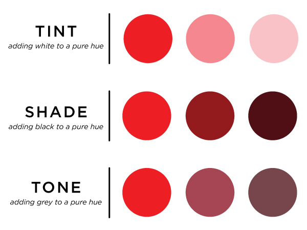
Tint: Color with a high value. Achieved by mixing a hue with either white pigment or white light
Shade: A color with low value. Made by mixing one or more hues with black.
Tone: Color of middle value. A combination of a hue with black and white.
Primary colors – Hues that cannot be derived or created by any others
Secondary colors: Hues that result from mixing two primary
Complementary colors: Two hues that when combined create white (light) or black (pigment). Opposites on a color wheel.
 |
| Primary colors of Pigment |
 |
| Primary colors of Light |
------------------------------------------------------------------------------------------
How does color make you feel?
Yellow – stimulating, cheerful, exciting, joyful, serene, unpleasant, aggressive, hostile
Orange – warm, happy, merry, exciting, stimulating, hot, disturbed, distressed, unpleasant
Yellow – stimulating, cheerful, exciting, joyful, serene, unpleasant, aggressive, hostile
Orange – warm, happy, merry, exciting, stimulating, hot, disturbed, distressed, unpleasant
Red – happy, affectionate, loving, exciting, striking, active, intense, defiant, powerful, masterful, strong, aggressive, hostile, hungry
Green – youthful, fresh, leisurely, secure, calm, peaceful, emotionally controlled, ill
Blue – pleasant, cool, secure, comfortable, tender, soothing, social, disgnified, sad, strong, full, great
Violet – dignified, stately, vigorous, disagreeable, sad, despondent, melancholy, unhappy, depressing
Black – sad, melancholy, vague, unhappy, dignified, stately, strong, powerful, hostile, distressed, fearful, old
White – pure, tender, soothing, solemn, empty
Brown – secure, comfortable, full, sad, disagreeable
Example – McDonalds – old yellow and red versus new browns
Uses in Theatre –
Some general notes of conventional uses… but good designers will tell you to move away from the norm if it suits the production or the design concept!
- Most scenic designers use hues of medium saturation and value b/c the set is providing the background environment of the play and should fade from audiences’ awareness after initial visual statement.
- Costumes can have higher values… supposed to be looking at the actors wearing them!
- Lighting designers use complimentary tints (ie, pale blue and pale yellow) to create even more vibrant white light – makes colors used by other designers more vibrant. Light can change color appearance of scenic and costume design elements… so must work together and anticipate that.
- Color proximity: the placement and relationship of specific hues. Strongly contrasting colors create dynamic tension. What would you think of a man in an electric blue suit and neon yellow vest and tie? What about a navy suit with a pale yellow tie?
- Accent colors – small touch of contrasting color/hue
Table cloths, flowers, paintings, accent pillow
Jewelry, bags, shoes, scarves
No comments:
Post a Comment